Designing an apparel brand inspired by the wild and otherworldly spirit of the Pacific Northwest
Empowering modern hikers with thoughtfully crafted gear that channels the raw, mystical beauty of the Pacific Northwest into every adventure.
Services
Visual Identity
Industry
Clothing
The Challenge
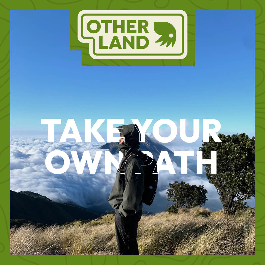
Rooted in the Pacific Northwest, Other Land blends functionality with the untamed, almost mythical spirit of the wilderness.
Other Land is a hiking and outdoor apparel brand shaped by the wild, majestic terrain of America’s Pacific Northwest. Inspired by fog-draped forests, jagged coastlines, and mystical alpine trails, the brand seeks to celebrate the surreal beauty of nature while equipping a new generation of explorers.
The challenge was to design a brand identity that balances rugged utility with dreamlike wonder—an aesthetic that feels grounded in the outdoors yet imaginative and evocative. The result needed to resonate with both seasoned hikers and modern adventurers, creating a visual language that invites people to explore the world beyond the trailhead.
Process & Exploration
Blending outdoor tradition with unexpected visual cues to shape a brand grounded in nature—but open to imagination.
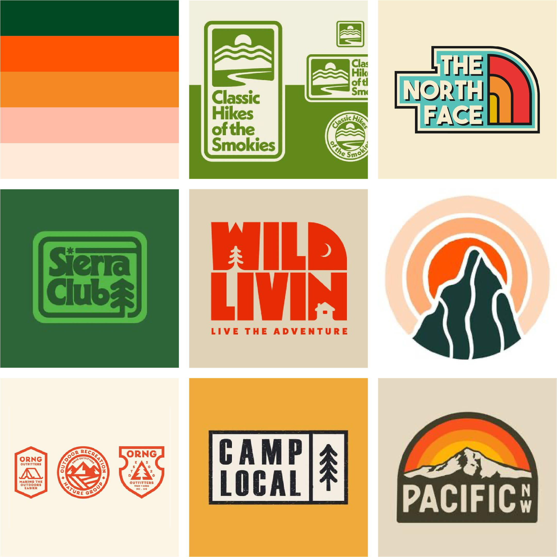
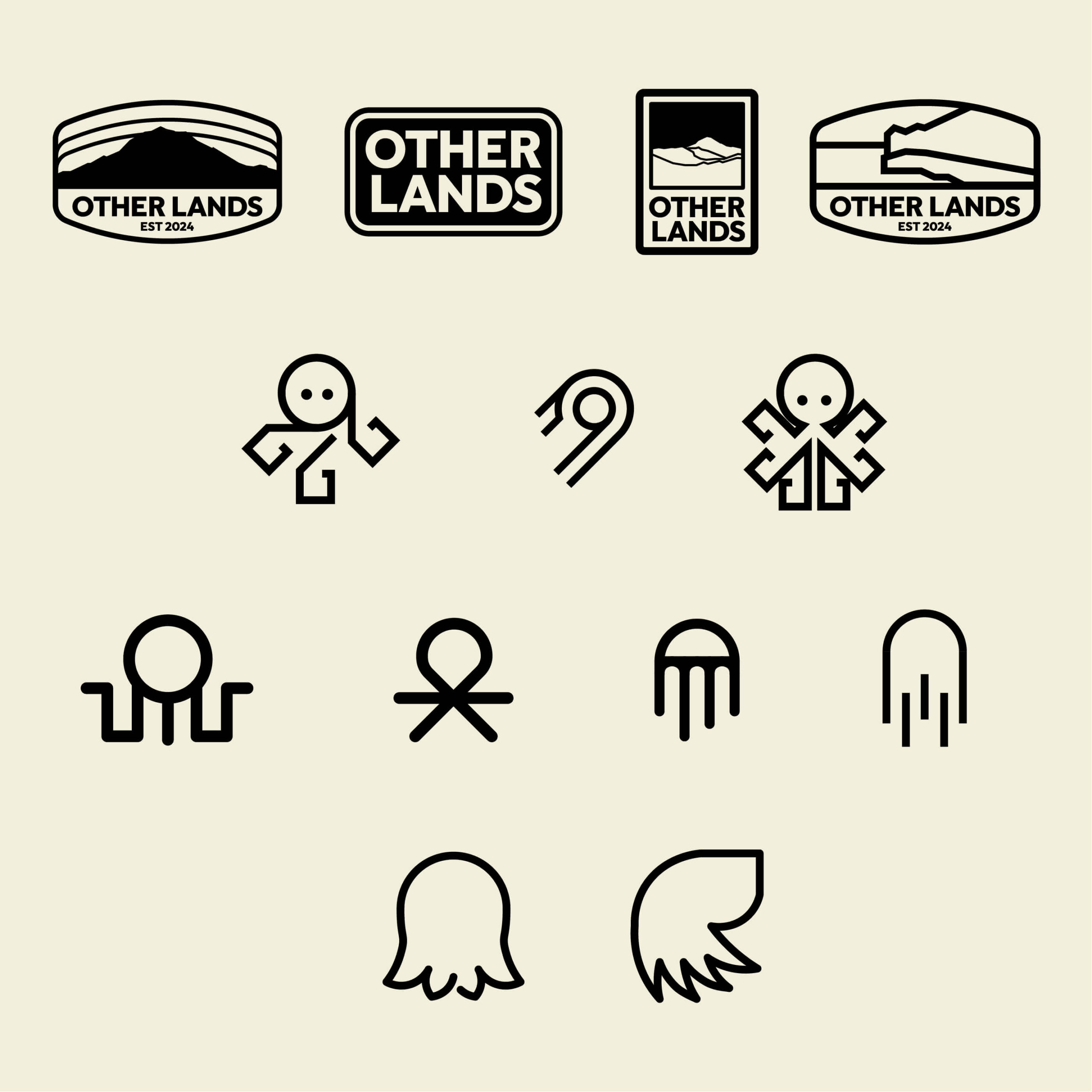
To bring the spirit of Other Land to life, the process began with a moodboard capturing the visual and cultural cues of the Pacific Northwest—earthy color palettes, textured type, vintage hiking patches, and trail signage. The references ranged from iconic outdoor brands to community-driven nature groups, each helping define a direction rooted in what the brief called “earthbound eclectic.”
The early explorations focused on bold, approachable type and traditional patch-style layouts, establishing a sense of place and ruggedness. One of the vintage-style badge designs initially felt like a strong fit—visually solid and familiar—but ultimately lacked the distinctiveness and storytelling depth the brand needed.
Further research led to the discovery of the Pacific Northwest tree octopus, a well-known internet hoax from 1998 that imagined a rare octopus living in the forests of the region. Strange, surreal, and deeply local—it captured exactly the kind of unexpected edge Other Land needed. This became the catalyst for a more symbolic direction, using the mythical octopus as a visual metaphor for curiosity, mystery, and exploring the unknown.
As the project evolved, the process moved toward deeper storytelling and symbolism—exploring how the brand could stand apart in a saturated space while still feeling part of an outdoor tradition. This phase opened up space for unexpected sources of inspiration and more abstract forms, eventually leading to a concept that reflects both familiarity and imagination.
Visual Identity
A nature-driven identity system built around bold typography, earthy tones, and a folkloric icon—balancing clarity, warmth, and wonder.
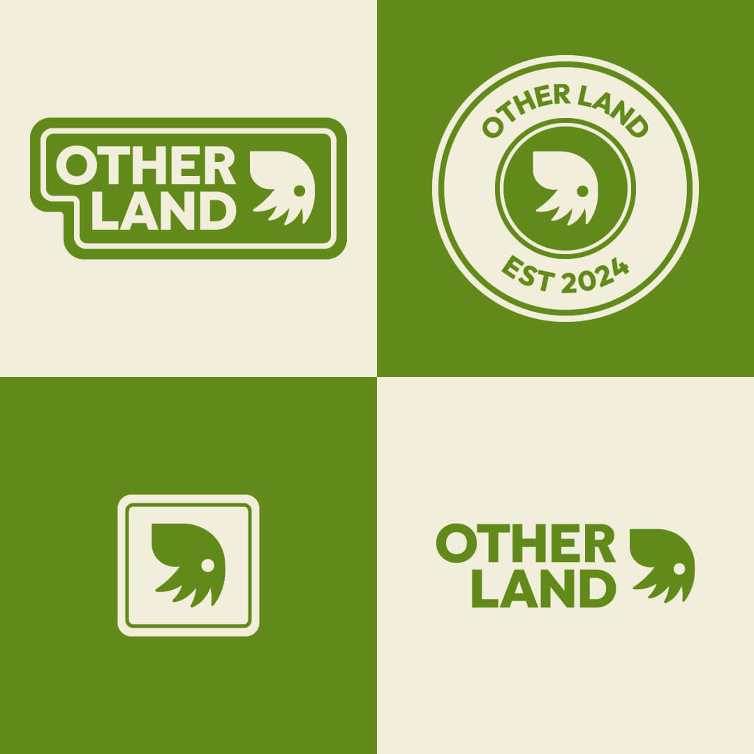
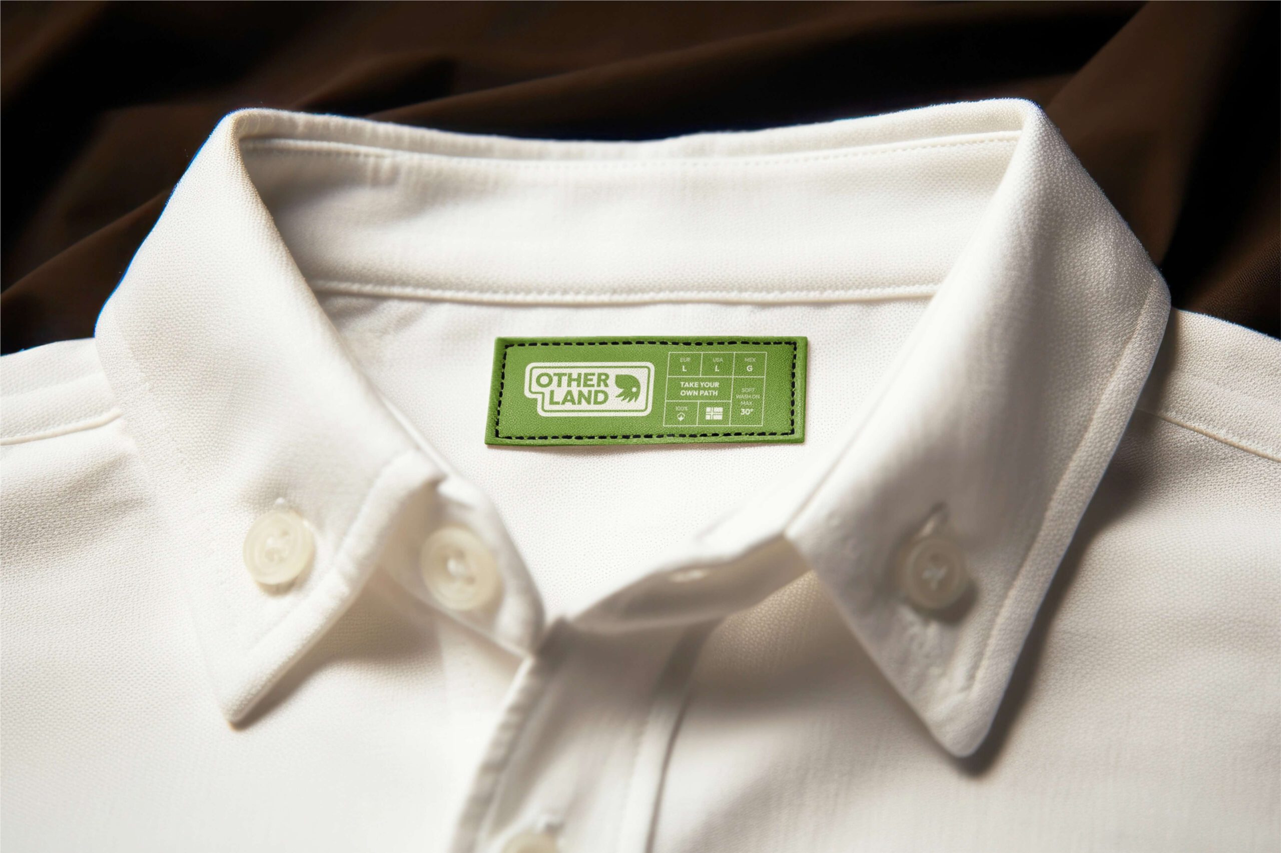
The identity for Other Land was built to capture the grounded yet imaginative essence of the Pacific Northwest. At the center sits a flexible logo system, anchored by a custom mark inspired by the mythical Pacific Northwest Tree Octopus—an internet hoax that became the perfect blend of folklore and playfulness. The octopus symbol offers both storytelling depth and striking simplicity, doubling as a badge, icon, and expressive brand element.
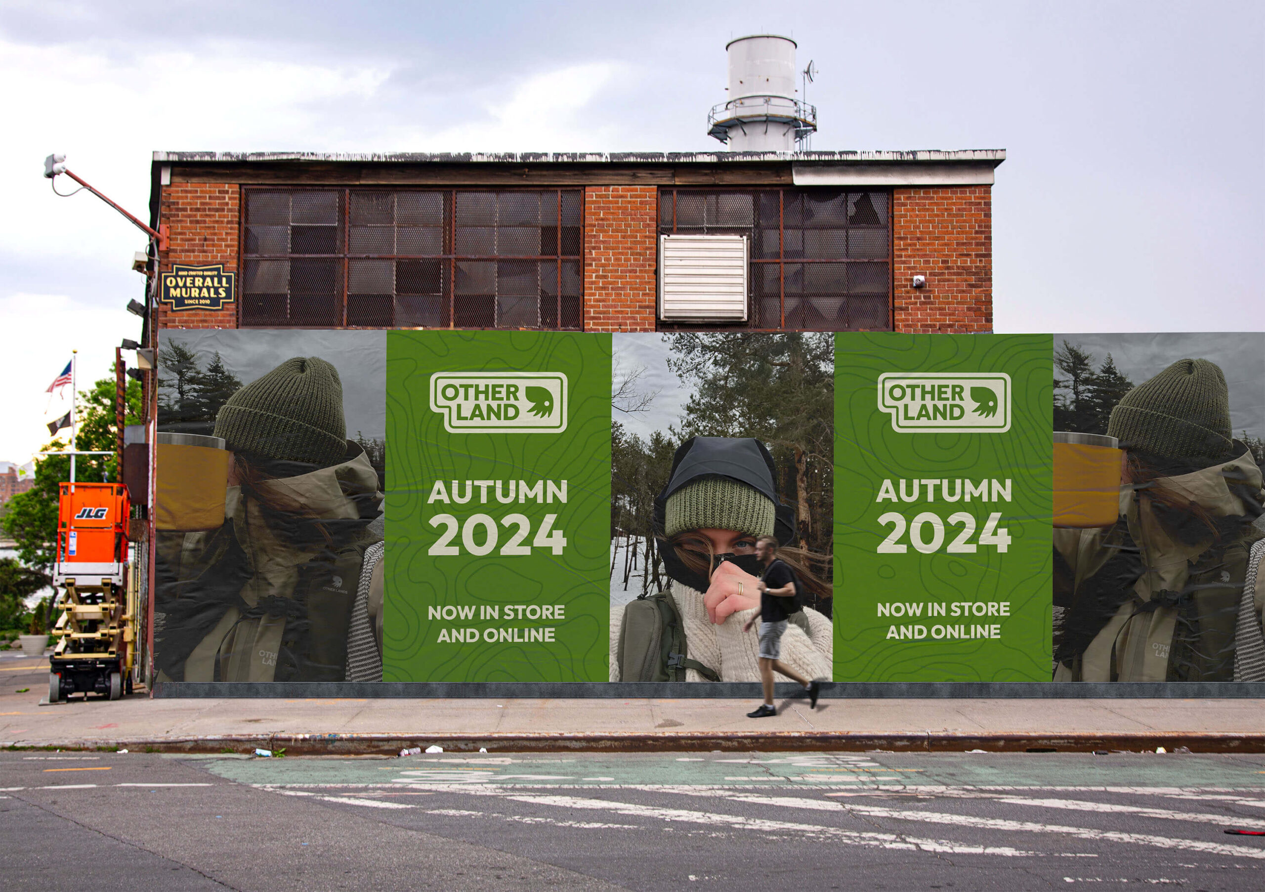
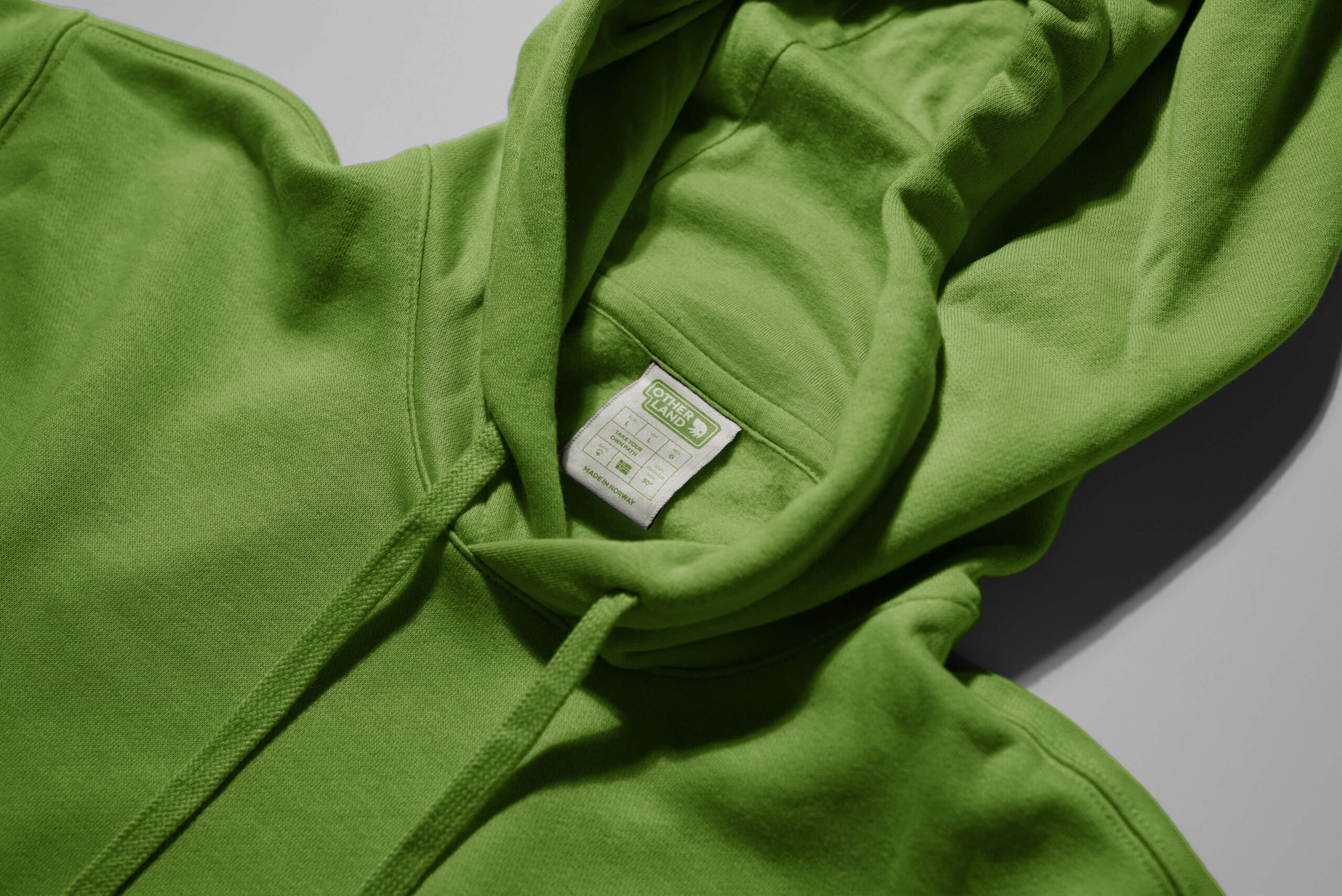
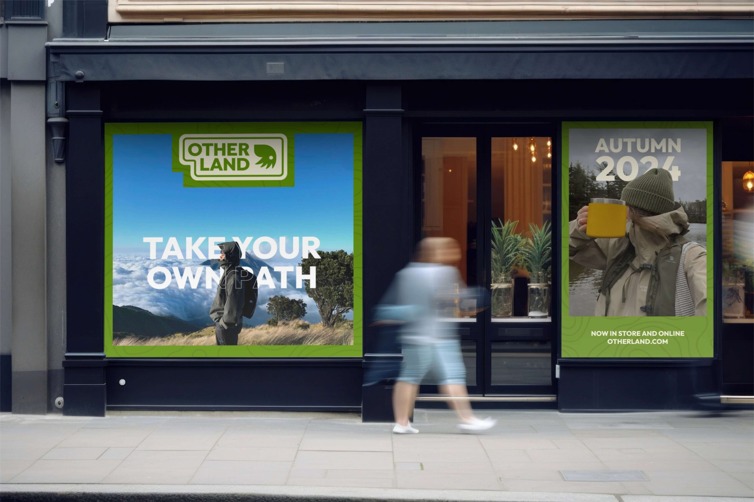
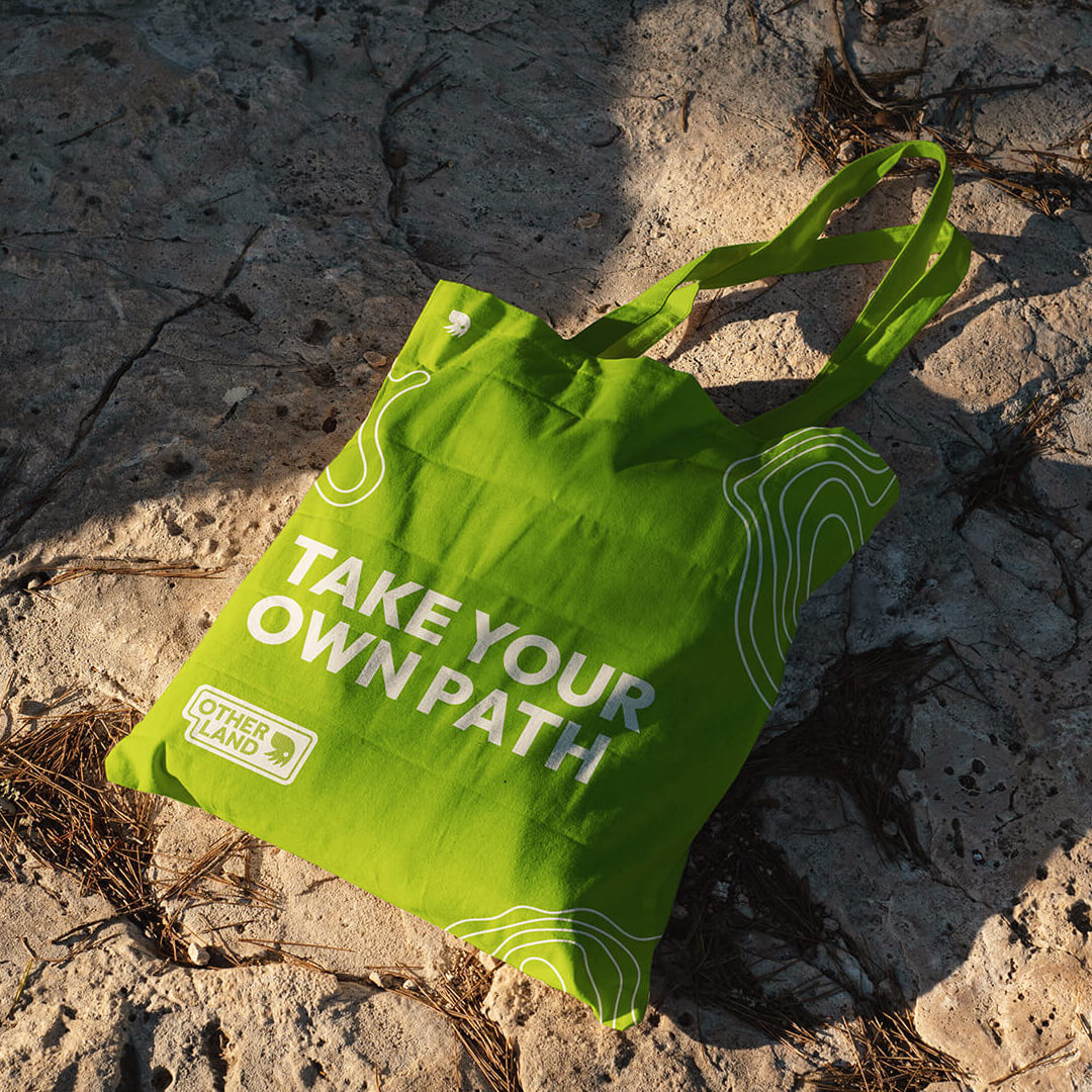
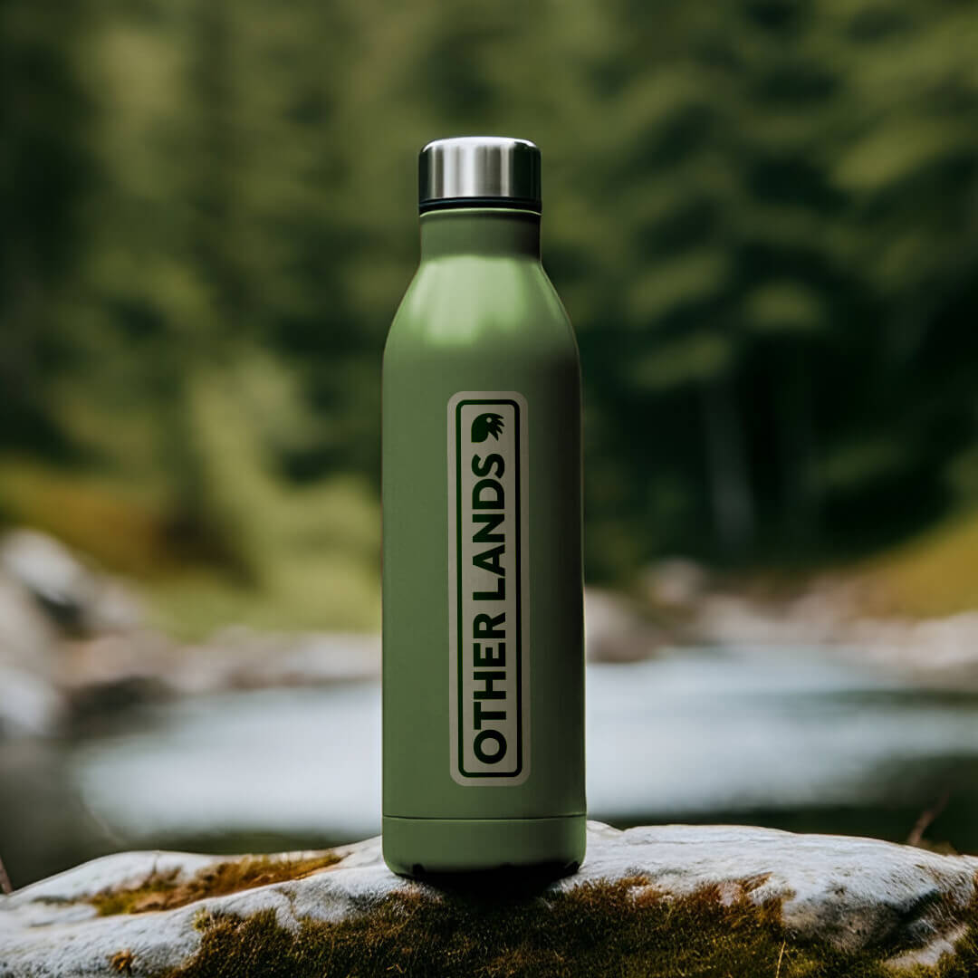
The logotype is bold and practical, using Outfit XBold to reflect reliability and clarity, while feeling fresh and contemporary. Paired with the iconic octopus symbol, it creates a strong, ownable identity that scales across packaging, apparel, and digital platforms.
The colour palette draws directly from the natural world—lush greens, sun-faded neutrals, and tonal gradients echo the varied textures of moss, forest canopies, and misty morning light. The topographic pattern adds another tactile layer, referencing maps, elevation, and exploration without relying on literal photography.
Together, these elements form a system that’s structured yet soft, vintage-inspired but modern—positioning Other Land as a brand rooted in place, ready to roam.
Outcome
Grounded in place, built for movement—an identity system that balances imagination and utility.
This project explored how brand identity can balance storytelling, place, and adaptability—without losing clarity. By anchoring the visual system in both regional heritage and playful imagination, the work for Other Land shows how even fictional brands can feel rooted and real.
The flexible logo system, color palette, and supporting assets create a strong foundation that translates across touchpoints—from apparel to signage to digital. This outcome highlights the value of thoughtful references, flexible thinking, and building identities that invite curiosity while remaining unmistakably clear.
Your brand deserves more than just a logo.
Let’s build a complete identity that feels right and looks even better—across every touchpoint.