A strong logo is more than a mark. it’s the starting point of your story.
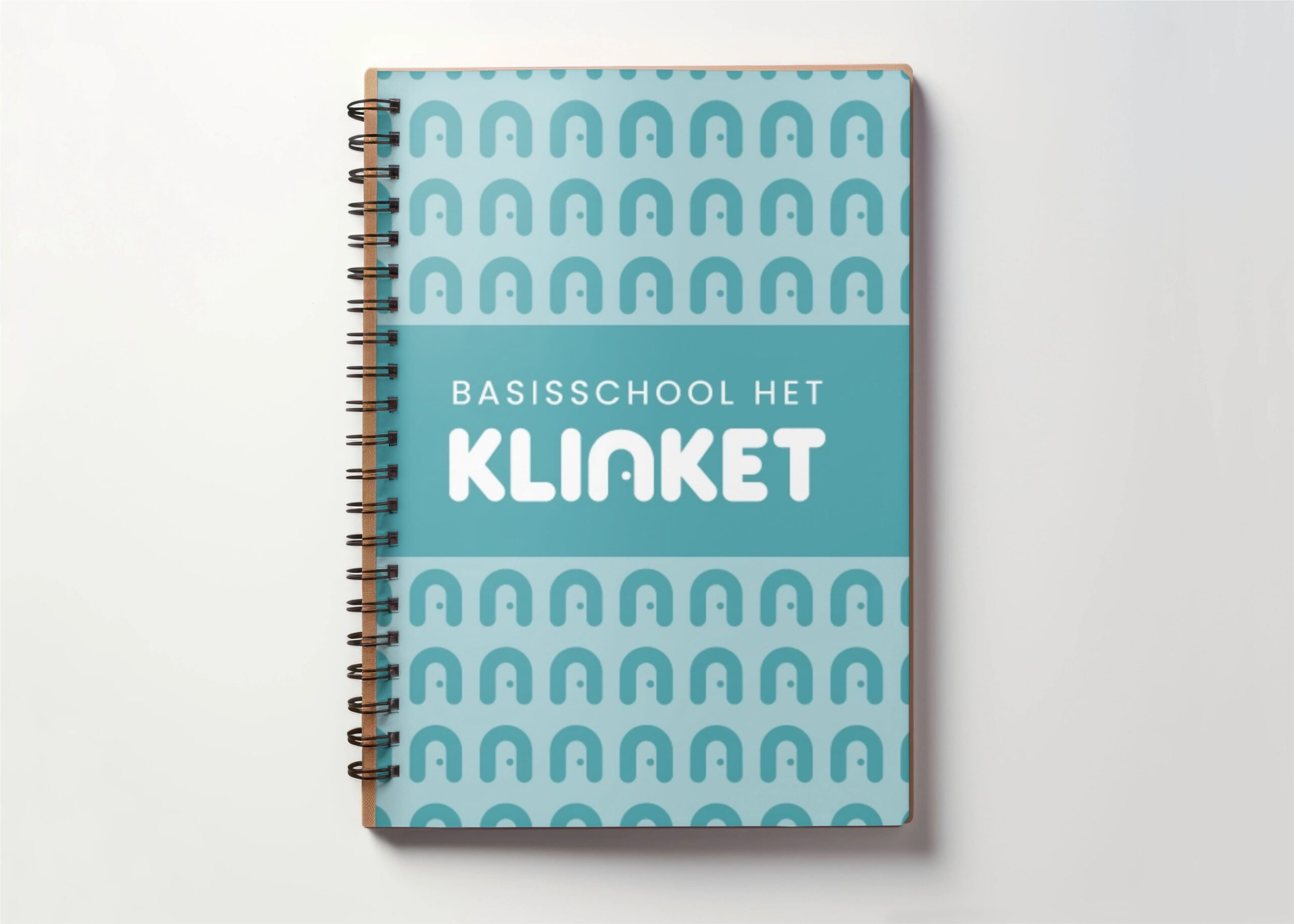
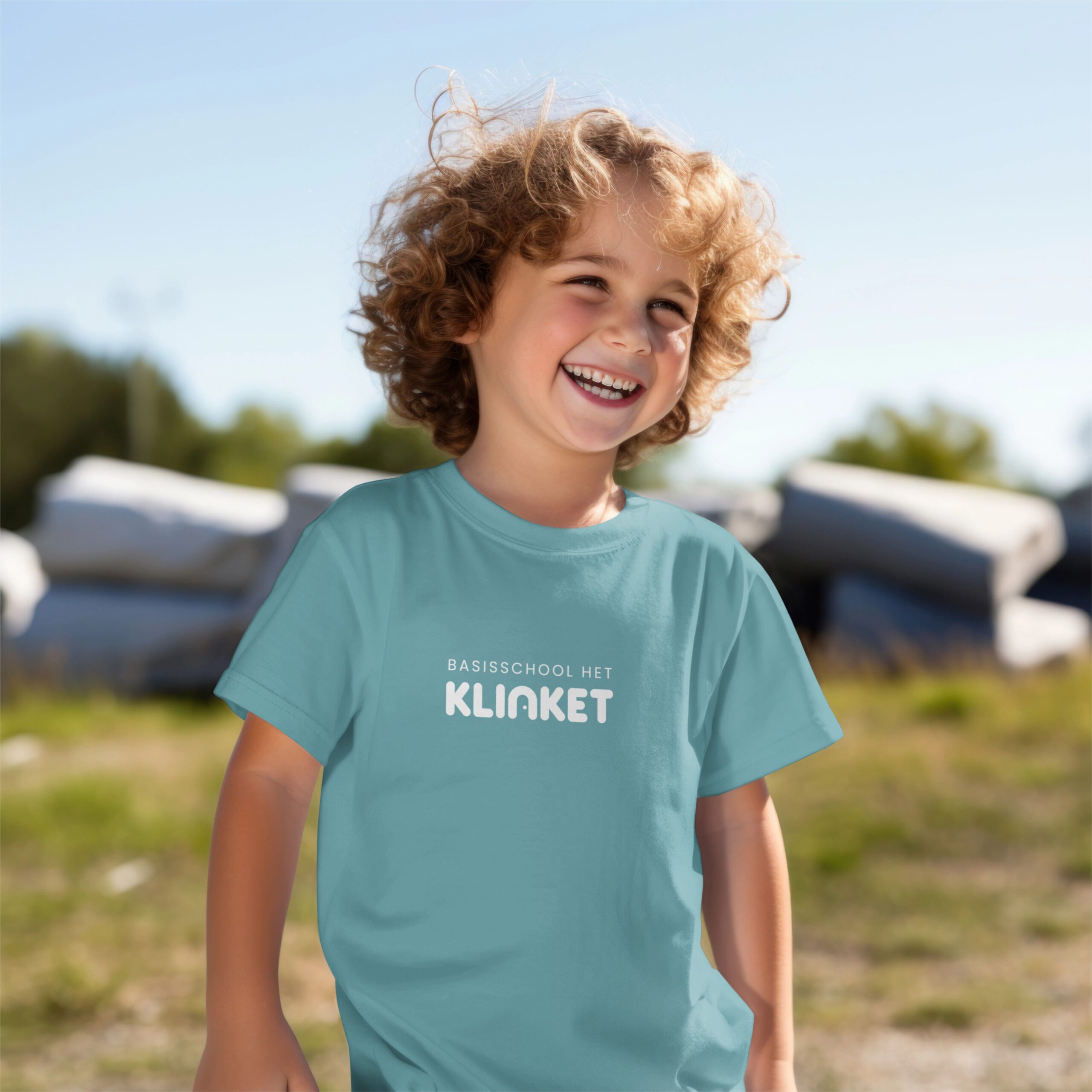
Basisschool Het Klinket
Modern, clear, and connected — a new look for one of Arnhem’s largest schools.
Basisschool Het Klinket, one of the largest elementary schools in the Arnhem region, recently collaborated with me to develop a fresh logo and an updated school report design. The new logo captures the school’s unique identity and commitment to the community, while the redesigned school report provides a clear and engaging format for students and parents. This project aimed to reflect Het Klinket’s values and modernize its visual presence, enhancing the connection between the school and its families.
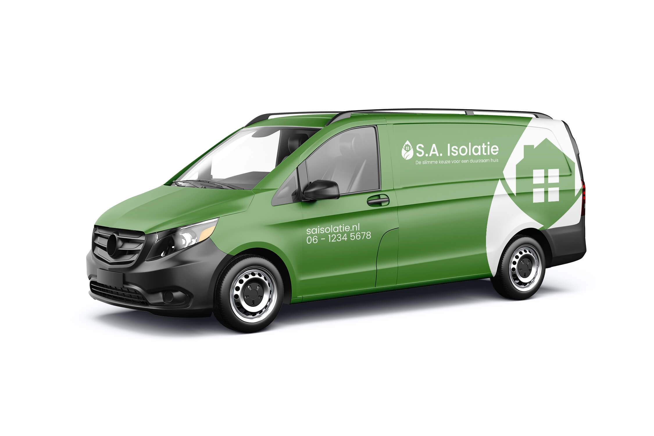
S.A. Isolatie
A fresh, eco-focused identity that reflects SA Isolatie’s sustainable vision.
The SA Isolatie logo was created to emphasize the company’s commitment to ecology and sustainability. Featuring a green leaf wrapped around a house, it symbolizes insulation, warmth retention, and eco-friendliness, with the green color chosen to highlight environmental responsibility.
The brand extends this eco-friendly theme through a fresh green color palette, which reinforces SA Isolatie’s dedication to a sustainable approach within the insulation industry. This leaf symbol is central to the brand’s visual identity, appearing across branded clothing, vans, and stationery, creating a cohesive and recognisable image that consistently communicates its environmental mission.
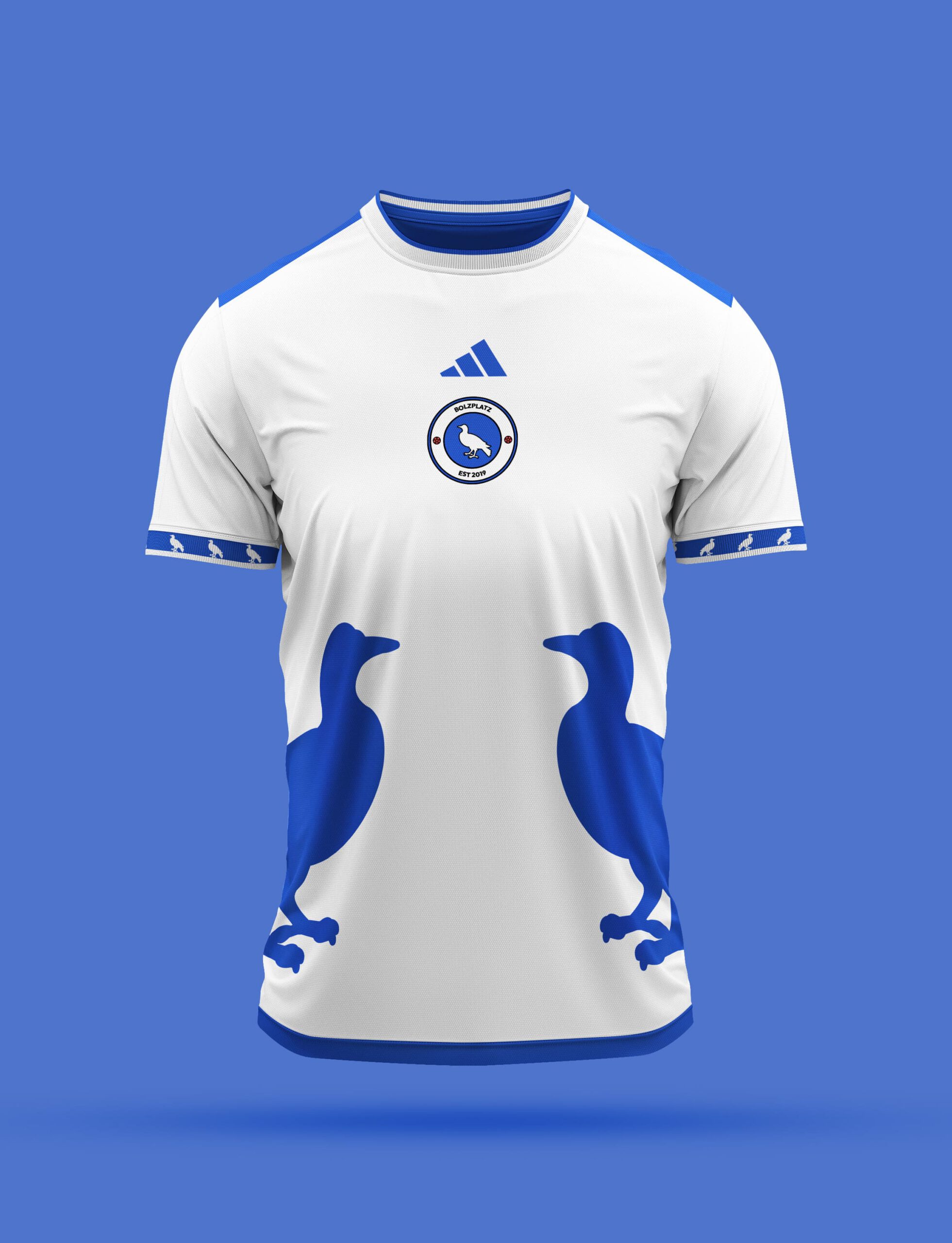
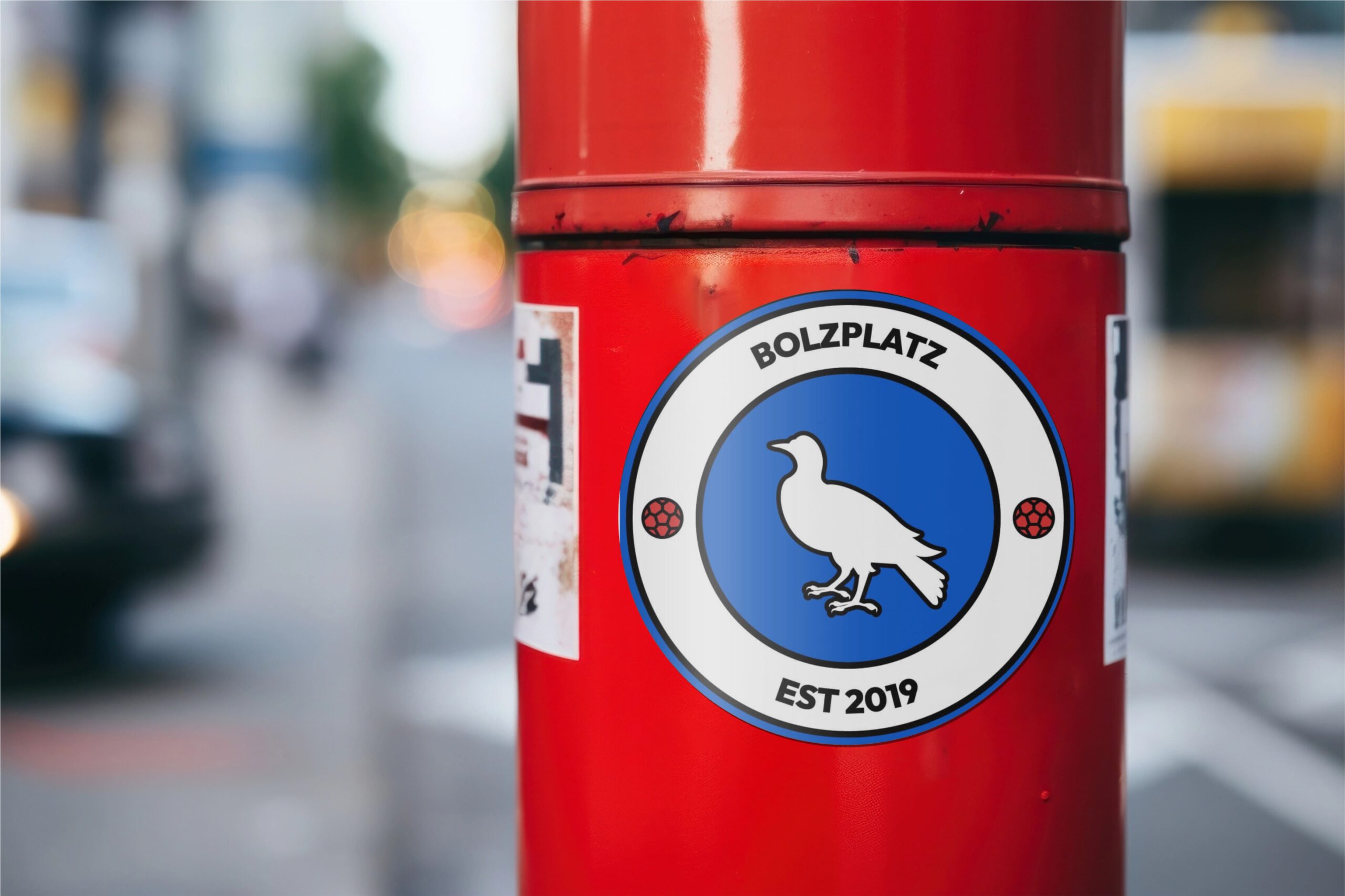
Bolzplatz
The Bolzplatz logo blends local pride and playful minimalism, featuring a pigeon from their hometown of Duiven and colors inspired by Arnhem.
The Bolzplatz logo was created for a football community built around local pride and the love of the game. The design features a pigeon — a nod to the group’s hometown of Duiven — paired with a blue and white color palette inspired by nearby Arnhem, where their boyhood club plays.
Playful yet minimal, the identity reflects both community and culture, blending street football energy with a clean, timeless look. Applied across stickers and merchandise, the logo brings the spirit of Bolzplatz to life wherever the game is played.
Gold Light
Shining with clarity and purpose, Gold Light’s brand reflects both innovation and precision.
The Gold Light logo was designed to capture the company’s precision and expertise in professional lighting systems. The wordmark subtly forms the shape of a lightbulb, symbolizing both innovation and the brand’s technical foundation. The yellow color palette reflects the warmth and clarity of light itself, while nodding to the “gold” in the name.
Together with a refined typeface and clean visual system, the identity conveys confidence and professionalism across every touchpoint—from stationery and vans to the website—ensuring Gold Light shines with consistency and purpose.
Your brand deserves more than just a logo.
Let’s build a complete identity that feels right and looks even better—across every touchpoint.